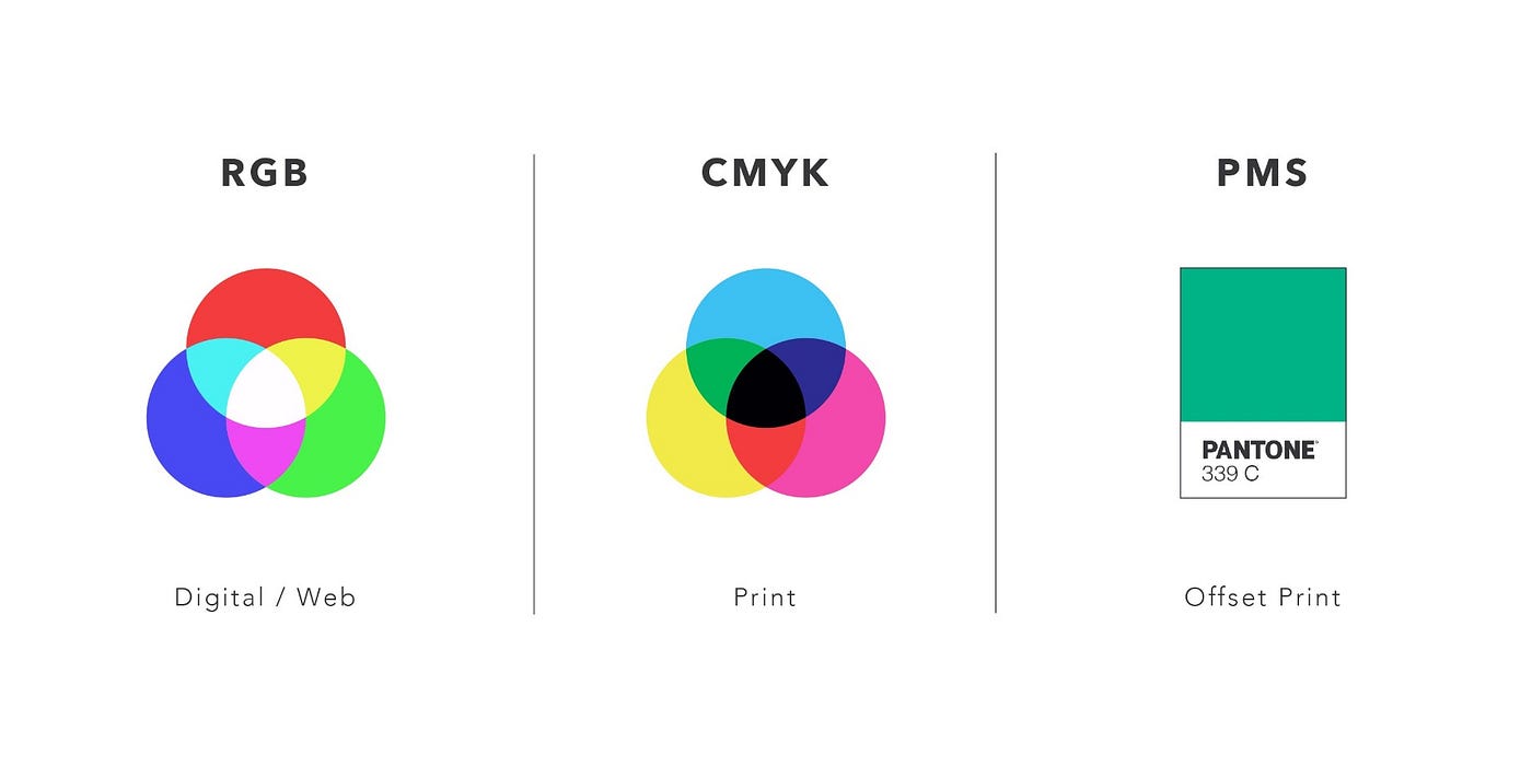
Demystifying Color: A Guide to RGB, CMYK, and PMS
by Natalia Emilse Elbaba on Apr 15, 2024The world of design thrives on color. It sets the mood, grabs attention, and shapes our perception. But for those new to the design game, navigating the technical side of color can be a head-scratcher. Enter the three color models that rule the roost: RGB, CMYK, and PMS. Each caters to a specific purpose, and understanding their differences is essential for achieving the perfect color palette in your designs.
RGB: Painting with Light on Screens
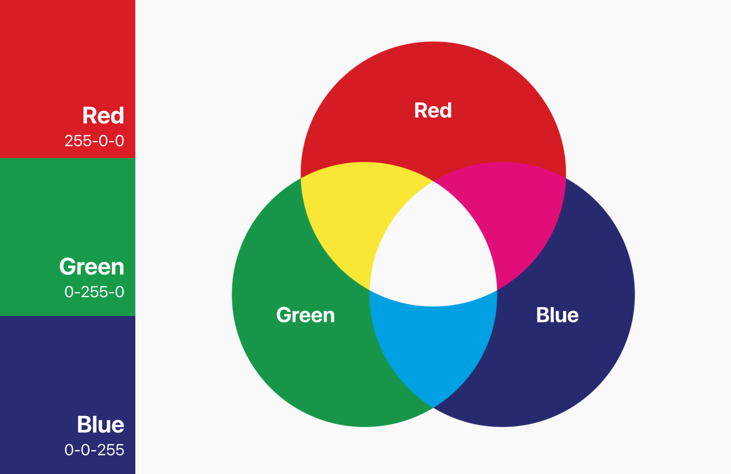
RGB stands for Red, Green, and Blue. This additive color model forms the foundation for how we see colors on electronic devices. Imagine millions of tiny light pixels on your screen, each capable of emitting red, green, or blue light. By combining these lights in various intensities, a vast spectrum of colors is created. When all three colors are at full blast, you get pure white light; conversely, their absence results in black.
Because it relies on emitted light, RGB is an additive color model. The more light that's combined, the brighter and more saturated the resulting color. This is why RGB excels in creating the vibrant and expansive color range we see on our screens. It's the go-to model for digital applications like web design, animations, and graphic design software.
CMYK: The Alchemy of Printing Inks
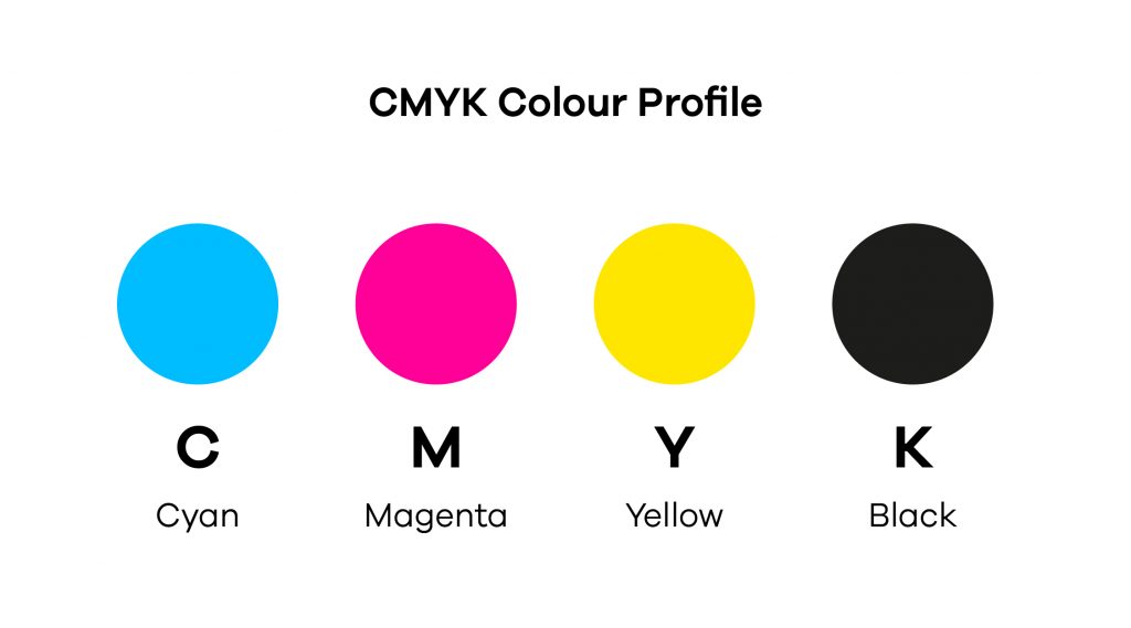
CMYK stands for Cyan, Magenta, Yellow, and Key (Black). Unlike RGB, CMYK is a subtractive color model used in the printing process. Here, colored inks are layered onto a white surface, typically paper. These inks act like filters, absorbing specific wavelengths of light and reflecting the remaining colors back to our eyes.
Combining CMYK inks creates a vast array of colors, although achieving a true vibrant red or green can be challenging. Black ink (Key) is used because mixing CMY inks often results in a muddy brown rather than a deep black.
CMYK is a subtractive color model because as more ink is layered onto the paper, less light is reflected, resulting in darker and less saturated colors. This model is the backbone of printed materials like brochures, magazines, and packaging. It ensures consistent color reproduction across printed copies, making it essential for the world of print.
PMS: The Spot Color Specialist
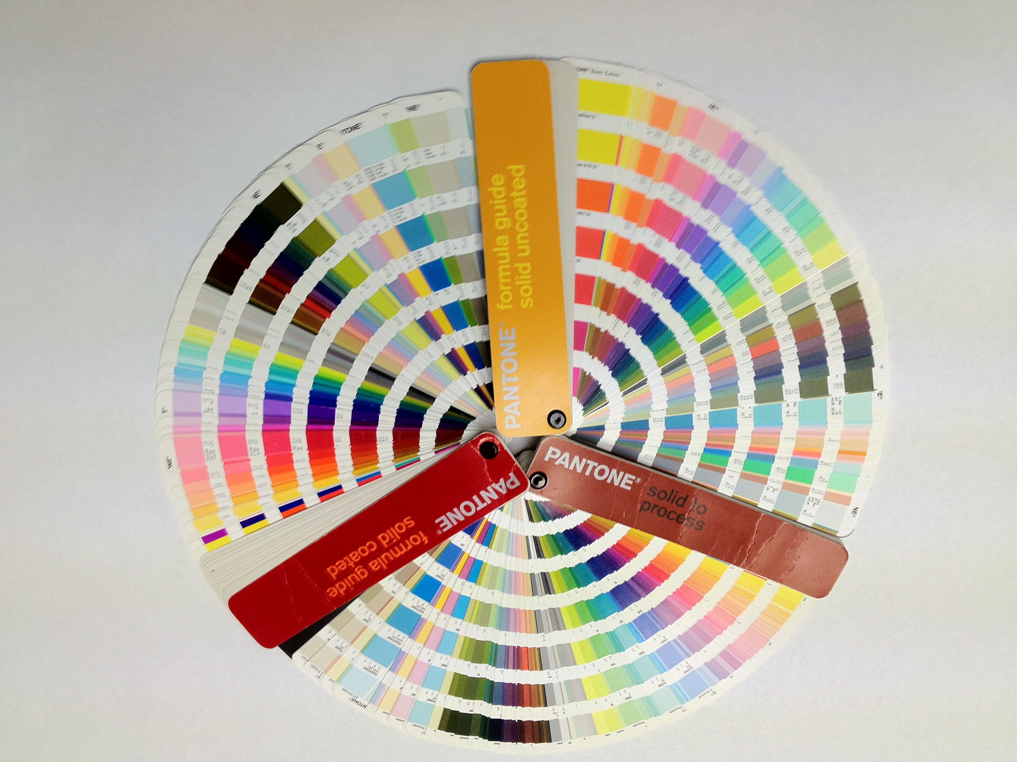
PMS, or Pantone Matching System, is a standardized color matching system. Unlike RGB and CMYK, which rely on mixing inks to achieve a desired color, PMS uses pre-mixed inks. This ensures exceptional color accuracy and consistency across different printing presses.
Think of PMS as a library of pre-made colors. Designers can choose specific colors from the Pantone Color Book, guaranteeing a precise match when printed, regardless of the press used. This is particularly crucial for branding elements like logos and company colors, where color consistency is paramount. However, printing with PMS inks can be more expensive than CMYK due to the additional setup costs involved.
Choosing the Right Color Model
So, with these three color models at your disposal, which one should you use? Here's a cheat sheet to help you navigate:
- Digital Design: RGB is your champion. Use it for websites, apps, presentations, and any visuals displayed on electronic screens.
- Printing Projects: CMYK reigns supreme. Choose CMYK for brochures, magazines, packaging, and any printed materials.
- Spot Color Accuracy: PMS is the star. If color consistency is critical for your project, like branding elements or specific design elements, PMS is the way to go.
By understanding the strengths and applications of RGB, CMYK, and PMS, you can ensure your designs look exactly as intended, whether illuminating a digital screen or gracing a printed page. Remember, color is a powerful design tool. Use it wisely to create stunning and impactful visuals that resonate with your audience!